About the Project
Good & Co reached out wanting to get a different take on their website as they believed it wasn’t communicating effectively or converting as well as they had hoped. They requested three different concepts within a four week turnaround to test and determine investing in a top-to-bottom redesign.
Content & Artifact Inventory
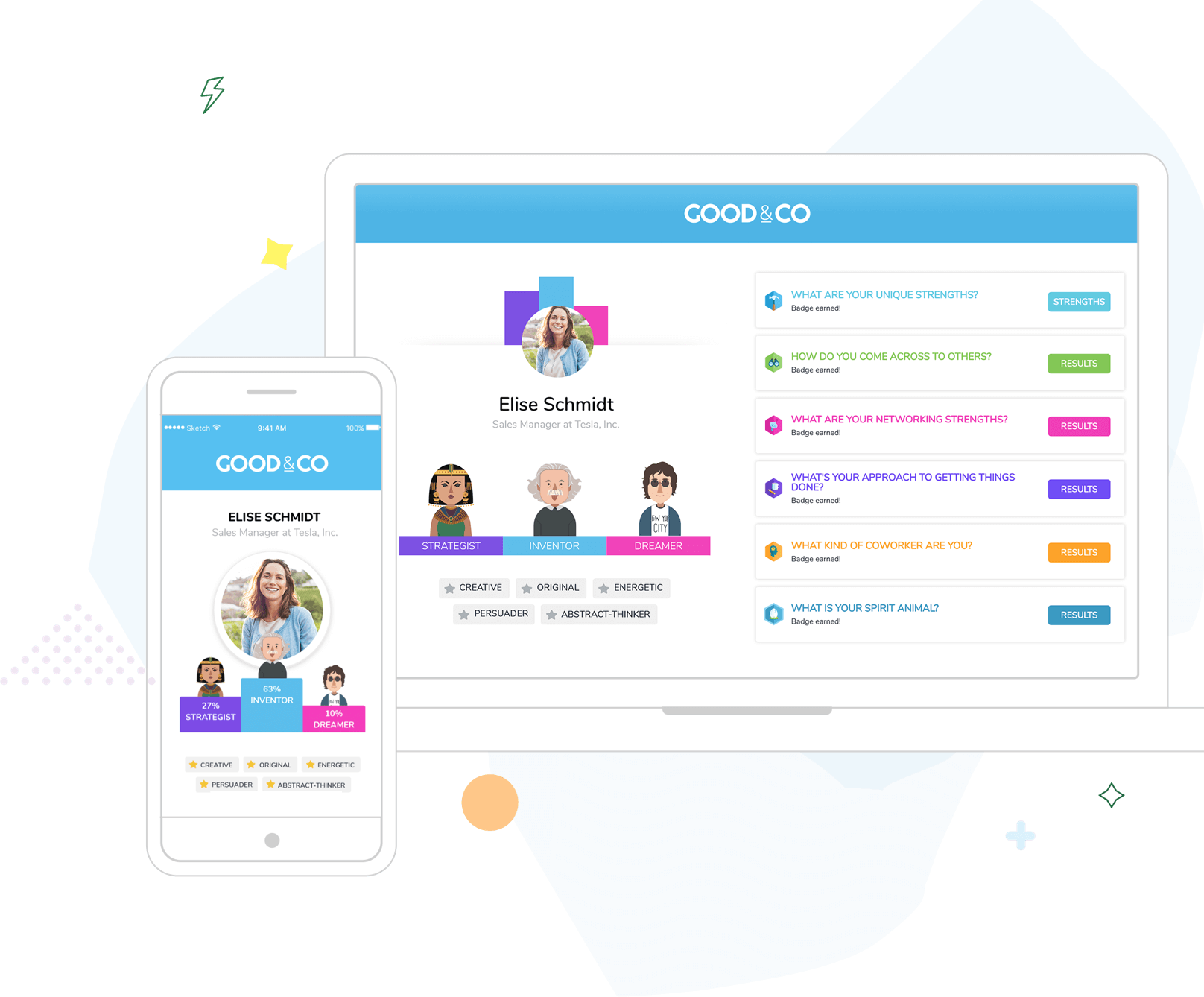
After a thorough audit, it seemed there was an expansive set of goals the site needed to accomplish, mixed with uncomplimentary designed elements, led to a disconnect with their target demographic.
Concepts
At their request, I provided three concepts I believed could expand well if developed and explored further.
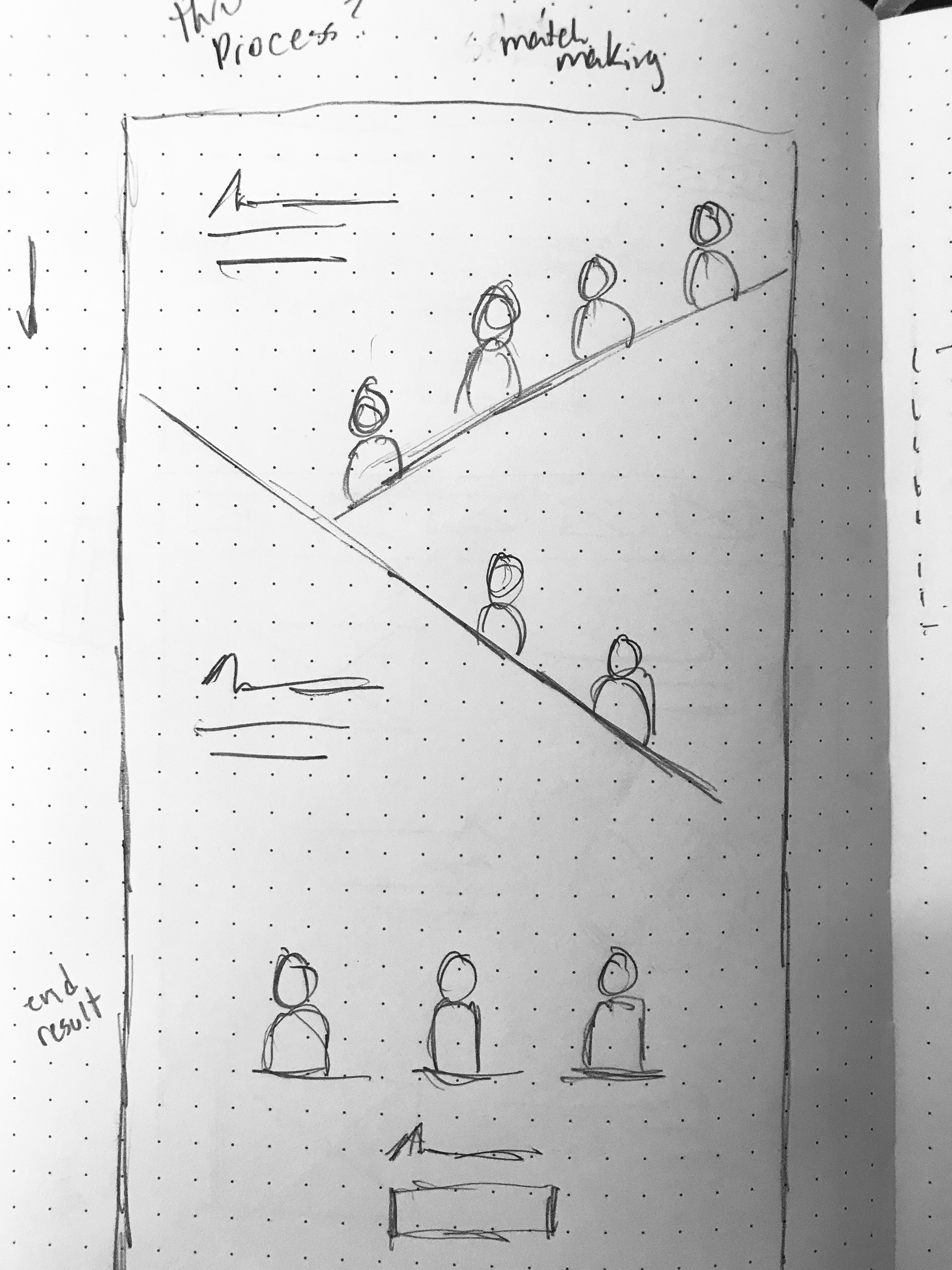
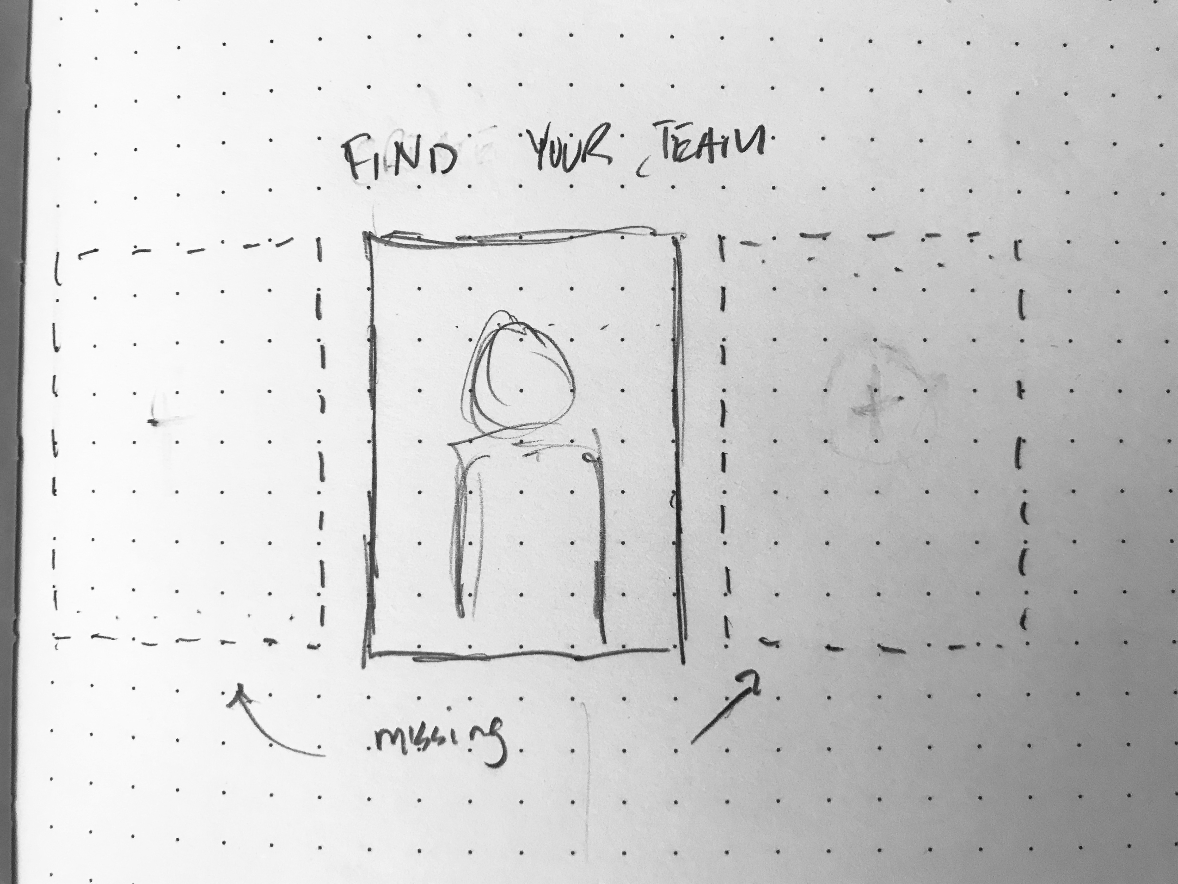
Early Sketches
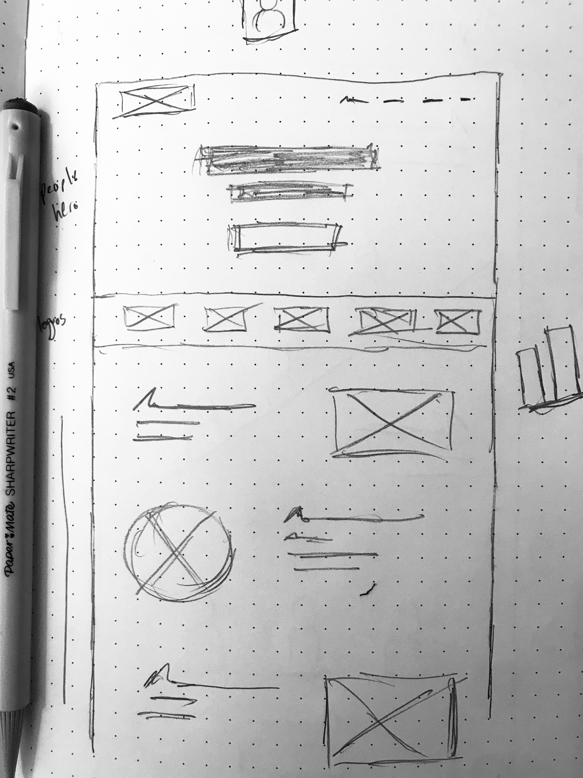
Concept One
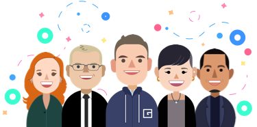
Use real human photos instead of the graphic art they’ve used for years. Focus on diverse individuals coming together as a team. Real faces.
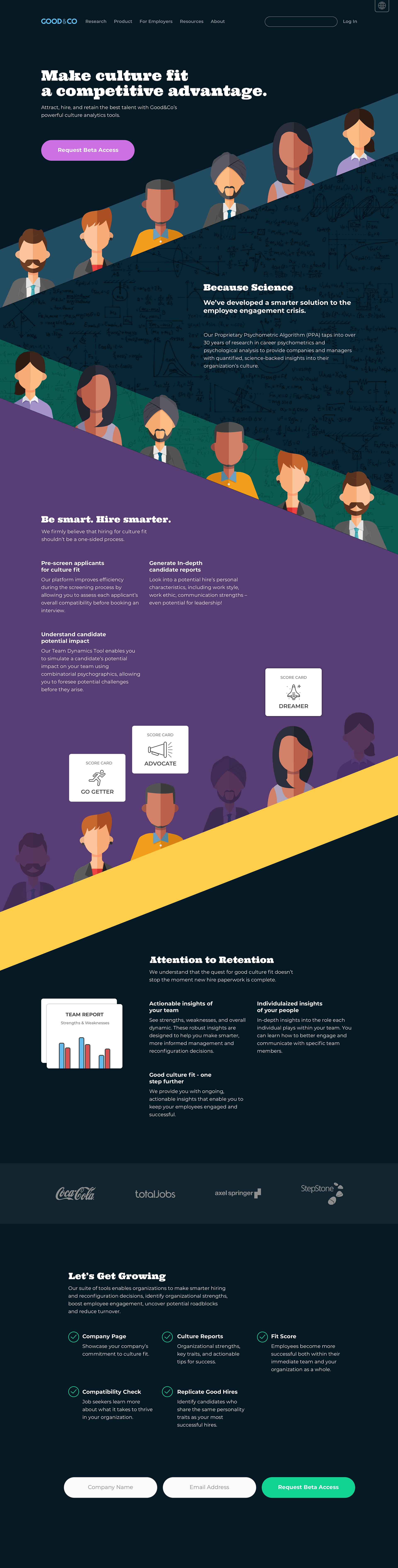
Concept Two
Using different graphics that convey diversity without a ton of detail. Use downward movement that brings individuals through their process and highlights them for team building. Subtle animation would bring it all together.
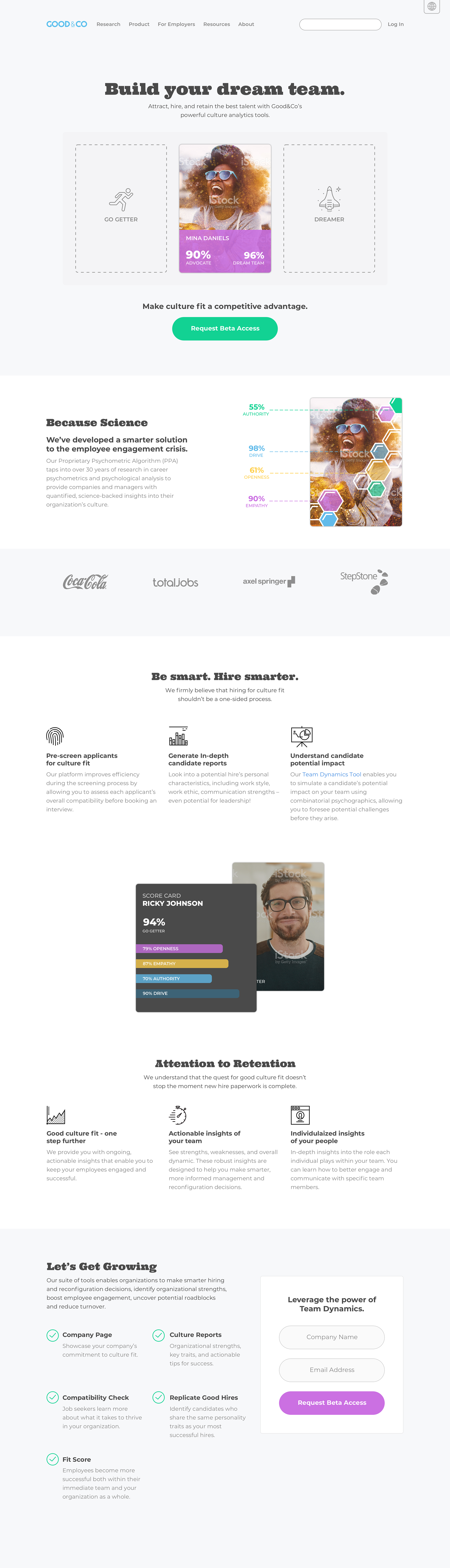
Concept Three
Softer UI. Graphics pulled way back. Focus on one story, a single person, going through the process that later gets matched up with two others.
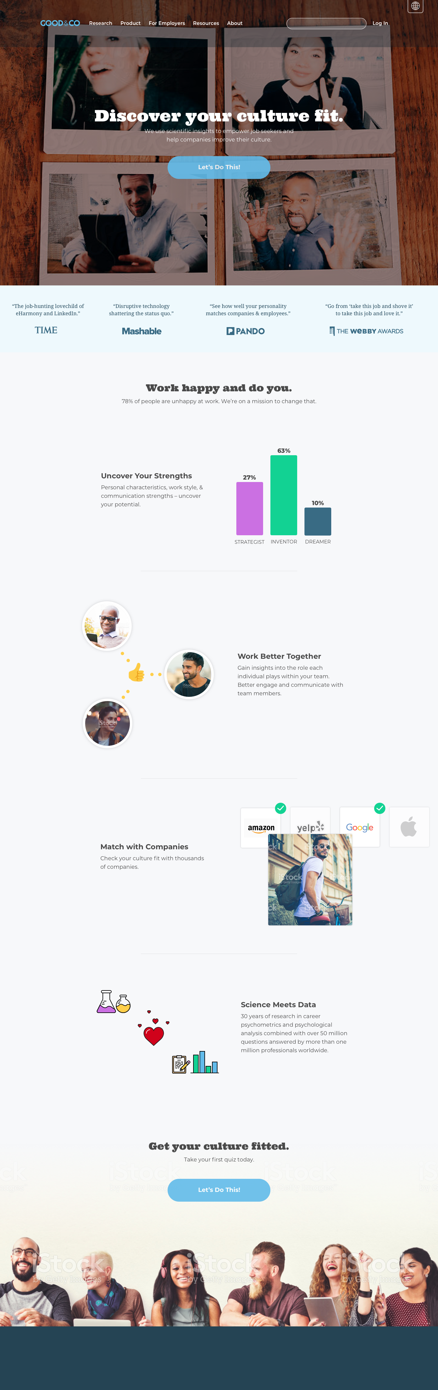
Result
Although Good&Co didn’t use these explorations, they agreed with my assessment of their site. They changed their messaging, began using more photos of real people, and started experimenting with graphics to represent archetypes. They’ve experienced higher conversion rates since.