About the Project
Jungle disk serves over 25,000 small to medium size businesses, offering a security suite of products that include encrypted storage, data backup, and network protection.
They were experiencing an unusually high bounce rate on their blog and wanted an updated aesthetic that was responsive, fit their new branding, and could work within their custom Jekyll environment.
At first glance, it was obvious this could use a visual update.
There are many symptoms of poor design, but it’s our job to diagnose the underlying condition.
Wanting to fully understand the root cause of this poor performance and working closely with the customer service team, we conducted interviews and surveys with stakeholders, customers, and some of the general public.
Research Objectives
Confirm users are not engaging, discover user motives behind reading (or not reading) content created by Jungle Disk, and be open to uncover any other pain points for consuming content online.
Qualitative Questions
• Tell me about the last online article you chose to read.
• Walk me through a time you read something online that really connected with you.
• Walk me through a time you last visited the Jungle Disk site.
• How would you describe "security?"
Utterances
“I’ve visited a couple times, but there’s not really any content there to read.”
“Usually you can tell pretty quickly if its something interesting, I scan a lot.”
“I’m already a customer and I see a lot about the company, but nothing that I was looking for.”
“I don’t know. How do I really know if I’m secure online?”
Quantitative Discovery
• Analysis on 200 most recent posts
• 24 different categories
• Only 3 categories referred to security
• Email newsletter was the dominate entry point to articles
• Significant abandonment after reaching first article
Research Insight
I quickly learned that, although the site could use a visual improvement for consuming and navigating content, the language used to describe basic security principles was not being understood by their target demographic, resulting in user frustration and early abandonment. This led me to work under a new objective: by creating an experience that is easy to navigate and leverages common language for non-technical users we can alleviate frustration and provide clarity and reassurance to those seeking to learn more about the security of their business.
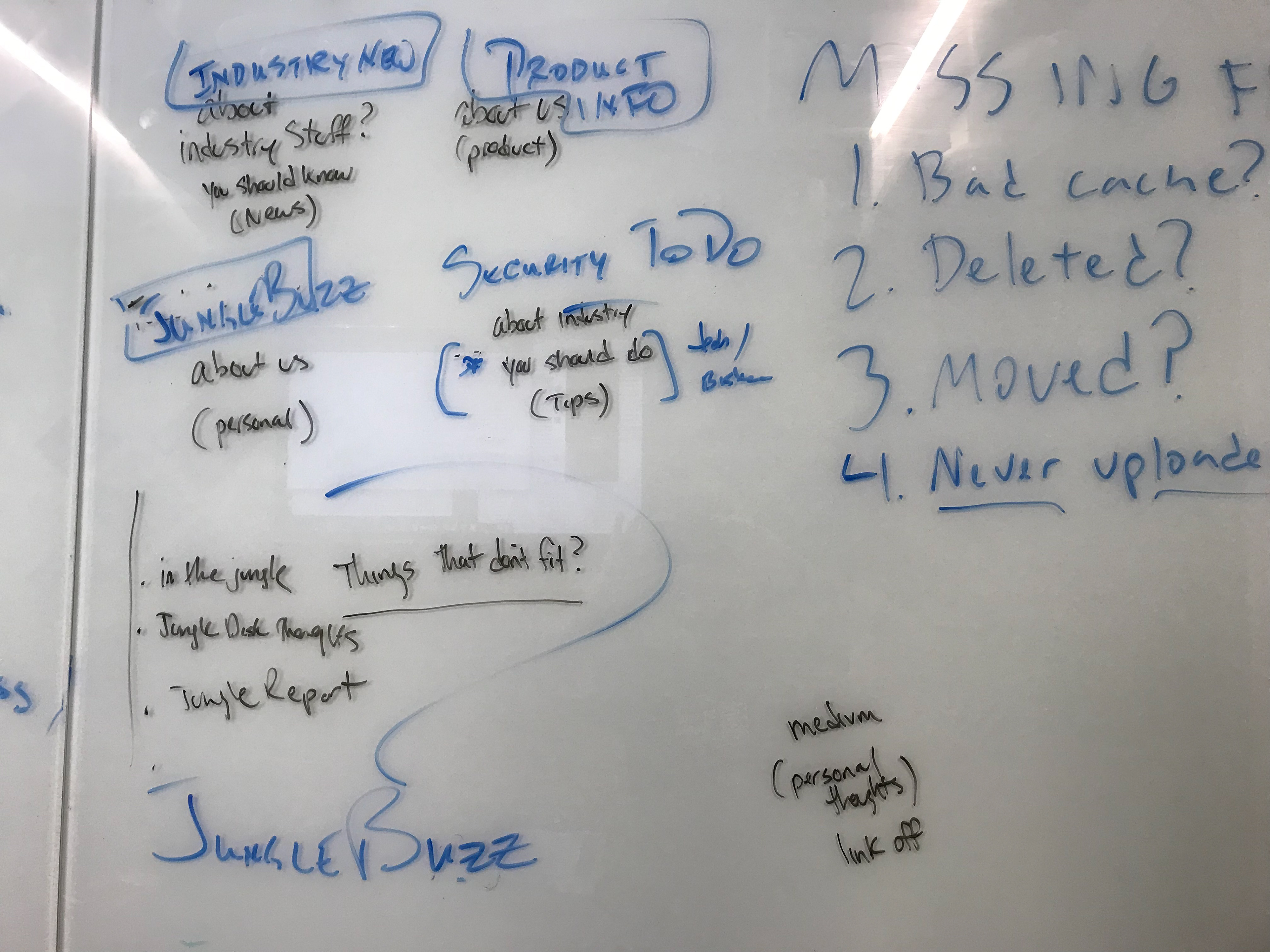
Information Architecture
Information architecture and light grouping activities with stakeholders were used as I set out to normalize nomenclature and reduce 24 categories into only 4.
Security Check • Product Info • Industry News • Jungle Buzz
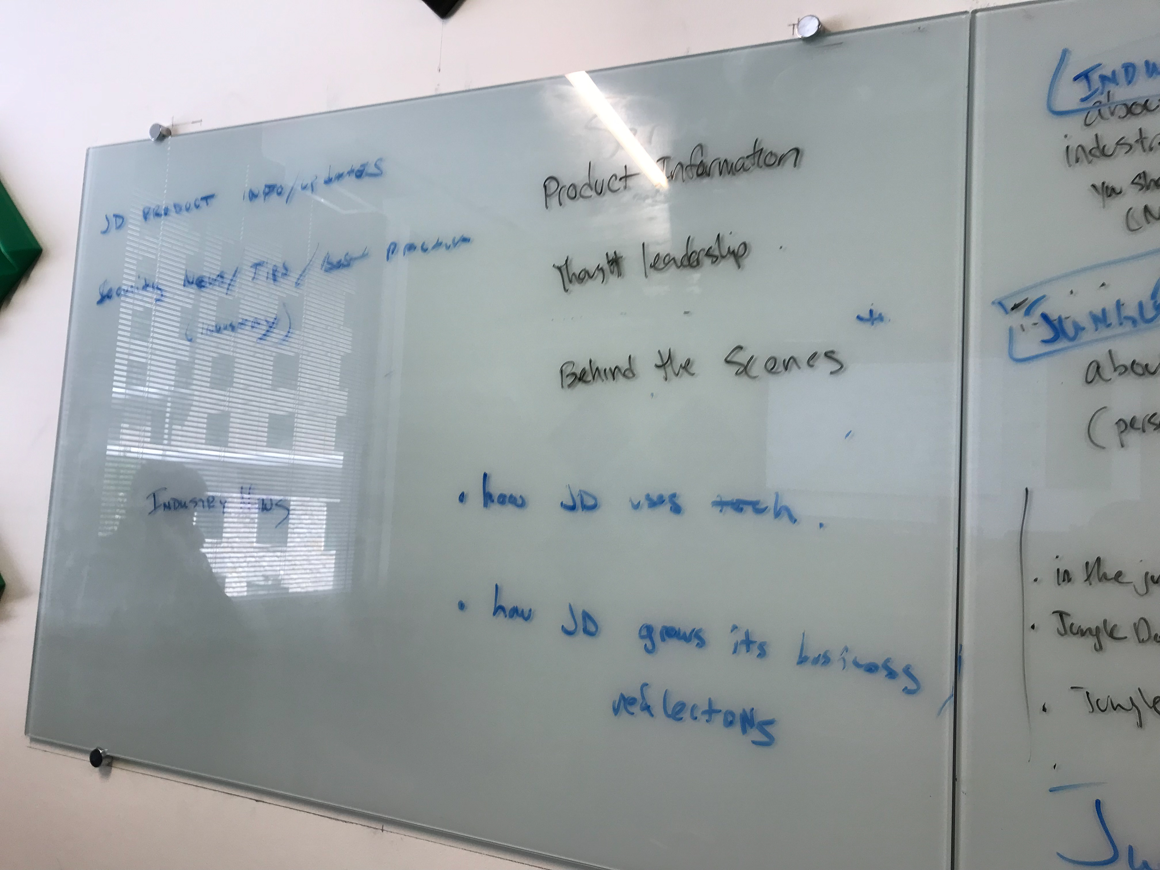
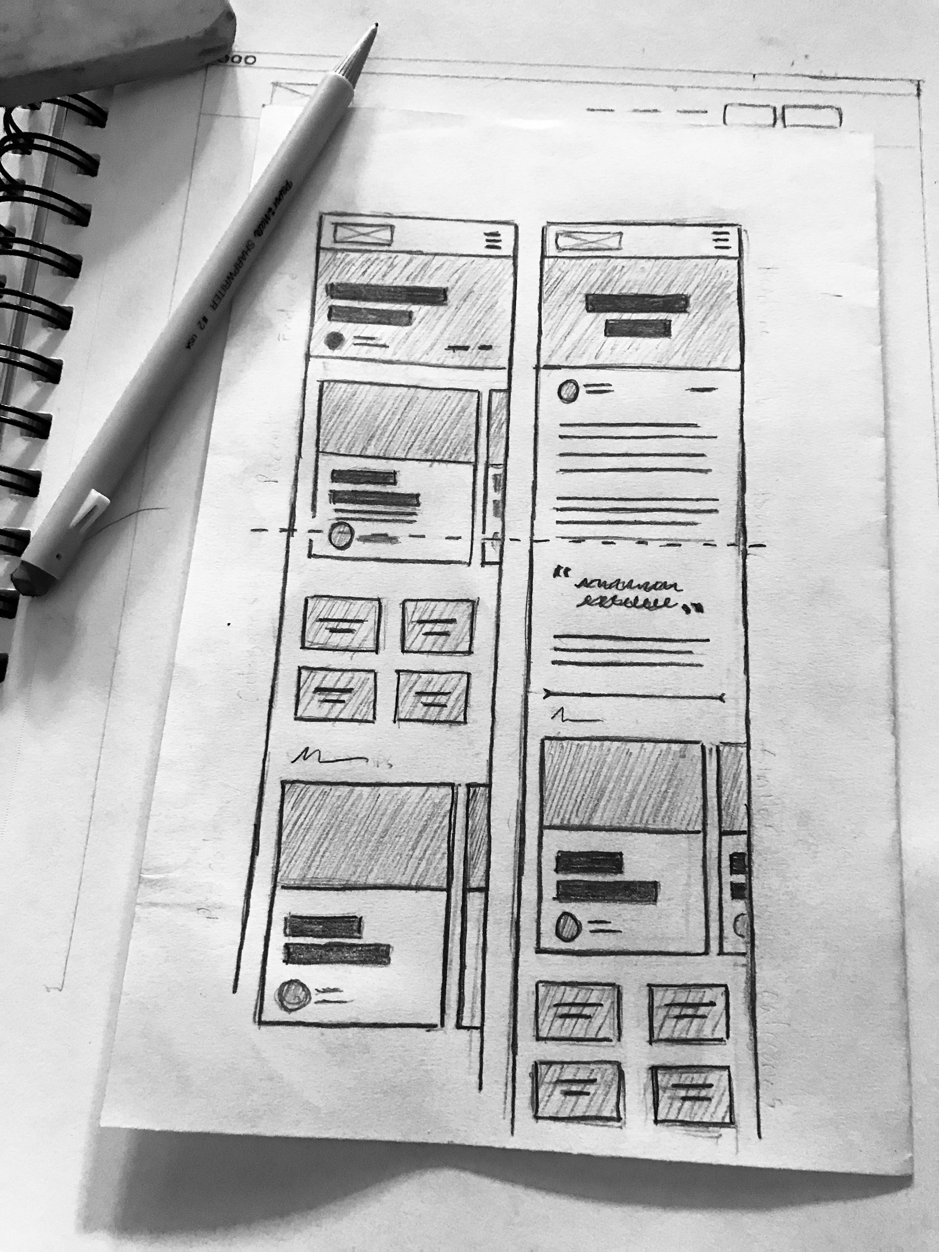
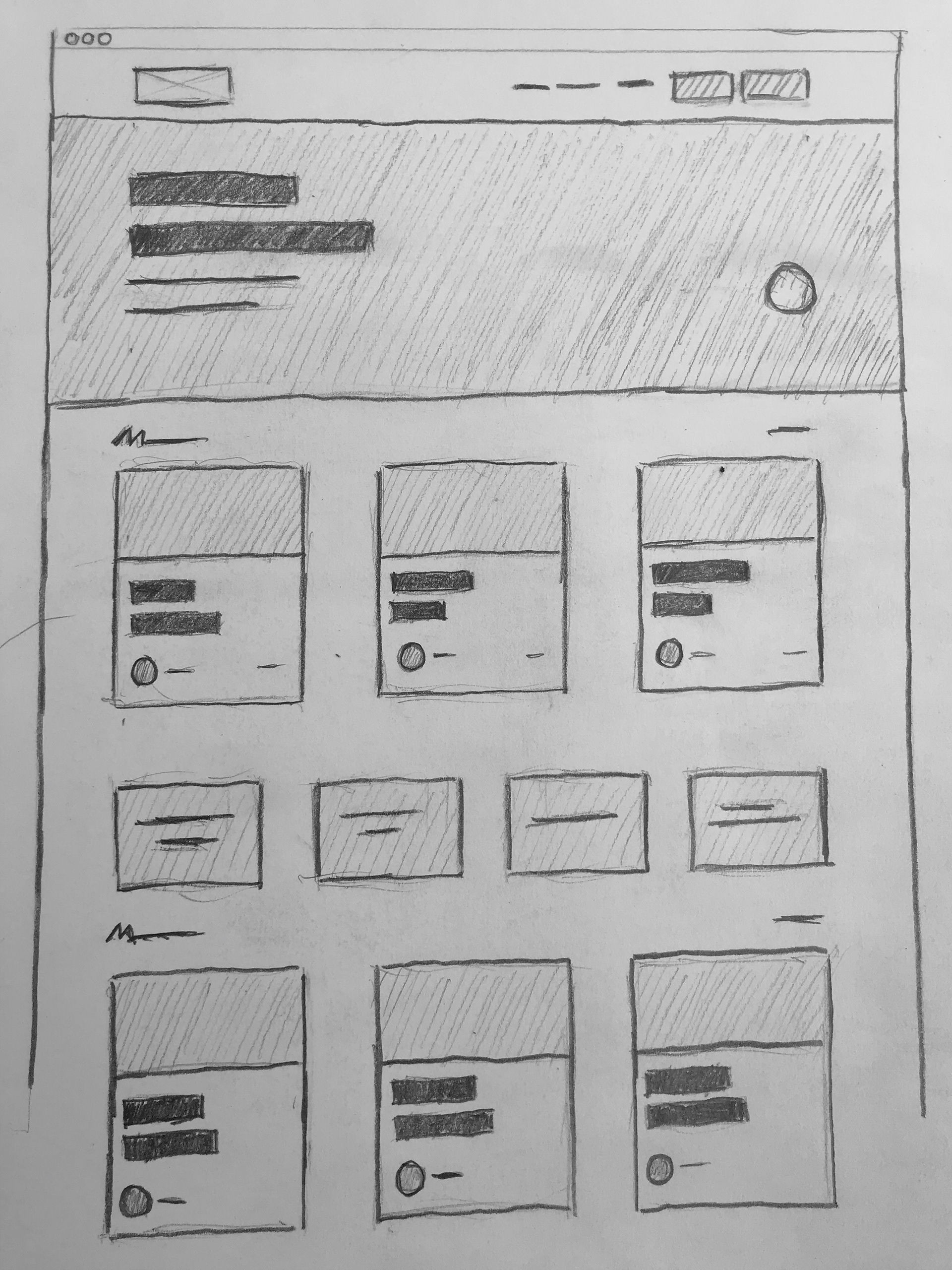
Sketching
Storyboarding, component sketching, and wireframing were used to explore taking advantage of established visual affordances for interacting with articles and blogs.
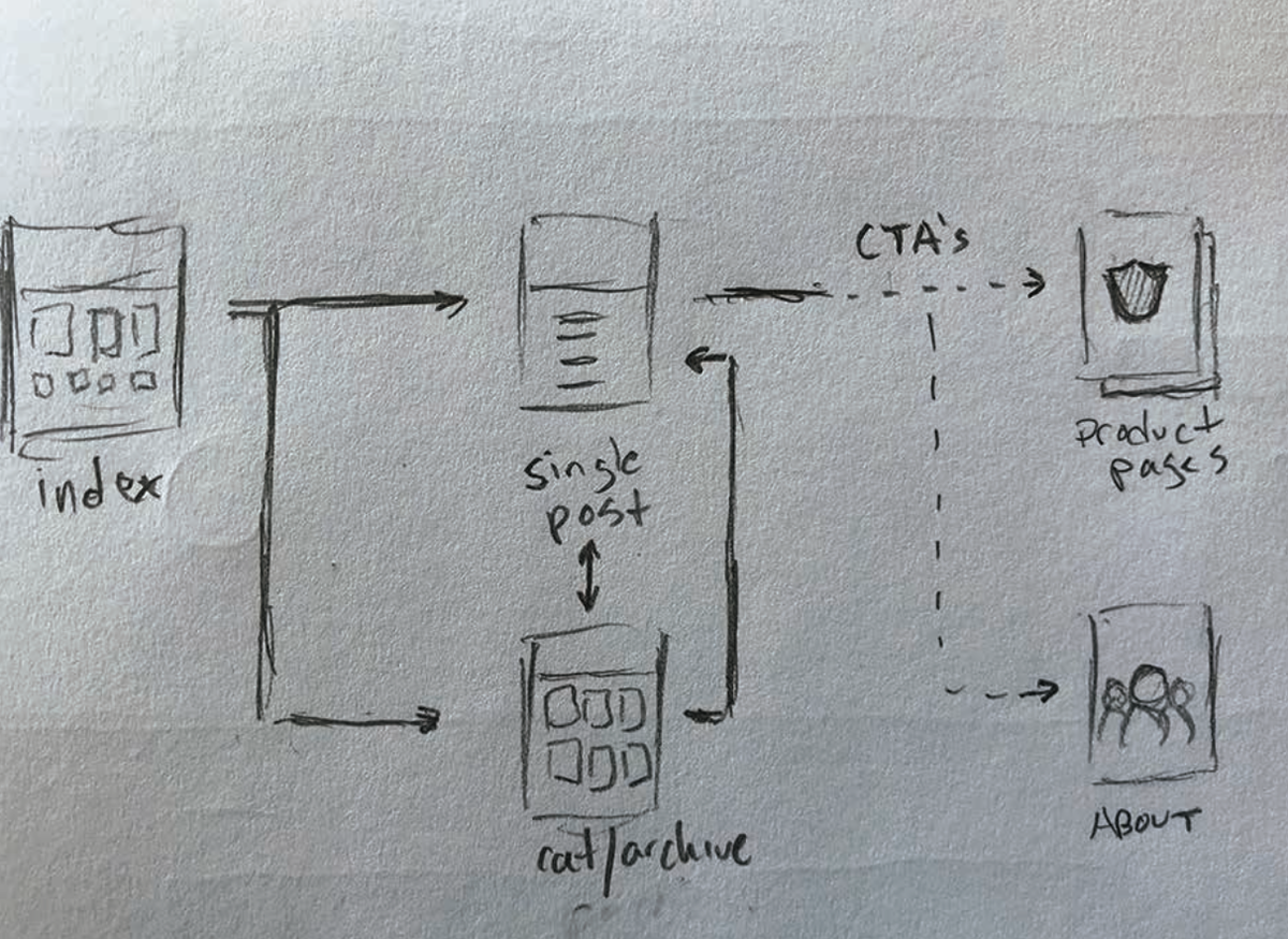
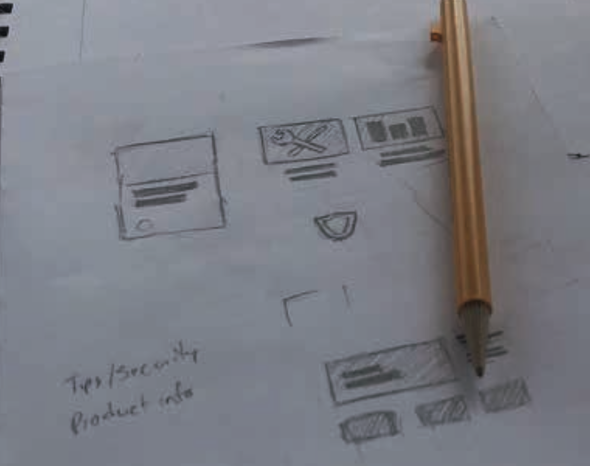
On-going collaboration with founders and other stakeholders inside marketing and I.T. departments was key to delivering the right content in a consistent and meaningful way, organization wide.
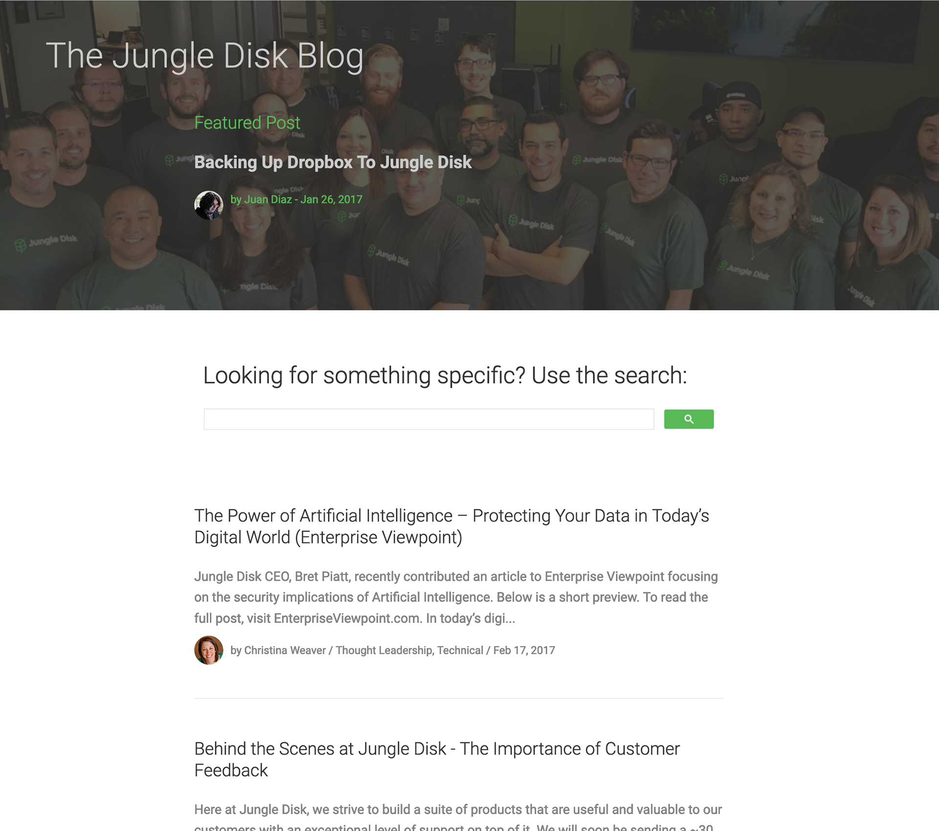
Hi-Fidelity Mockups
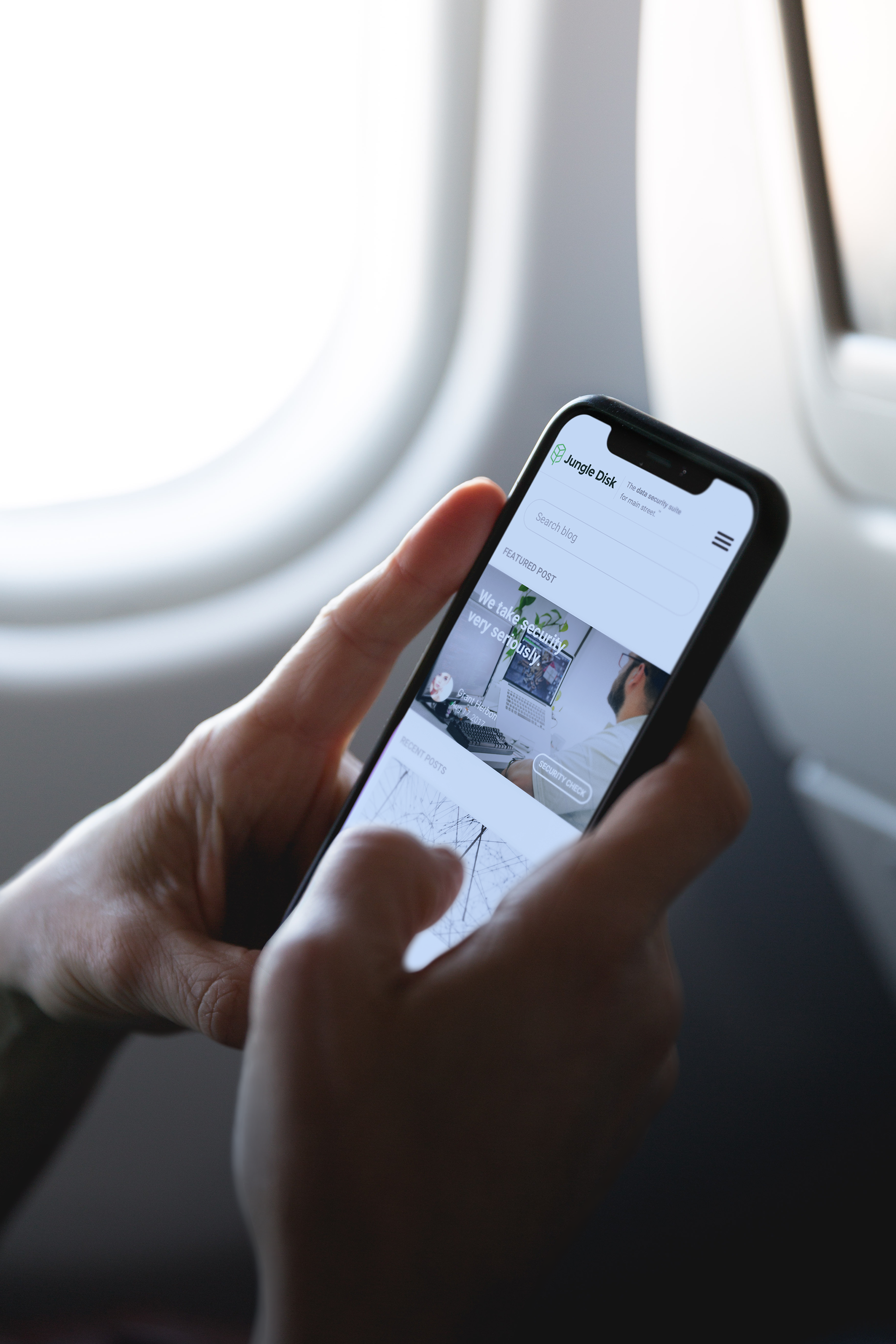
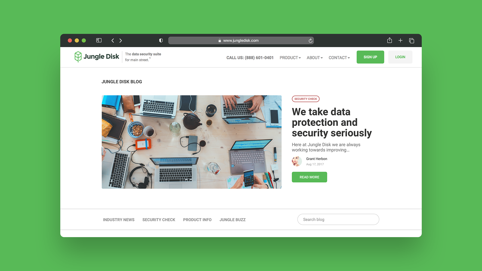
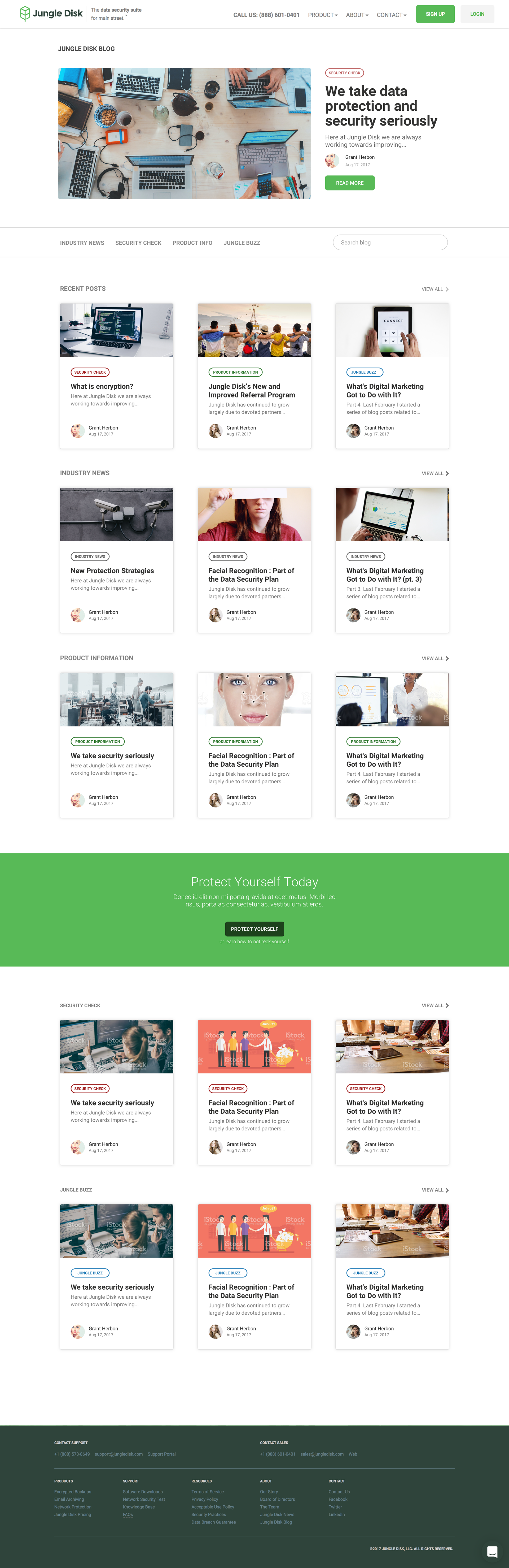
Blog Home
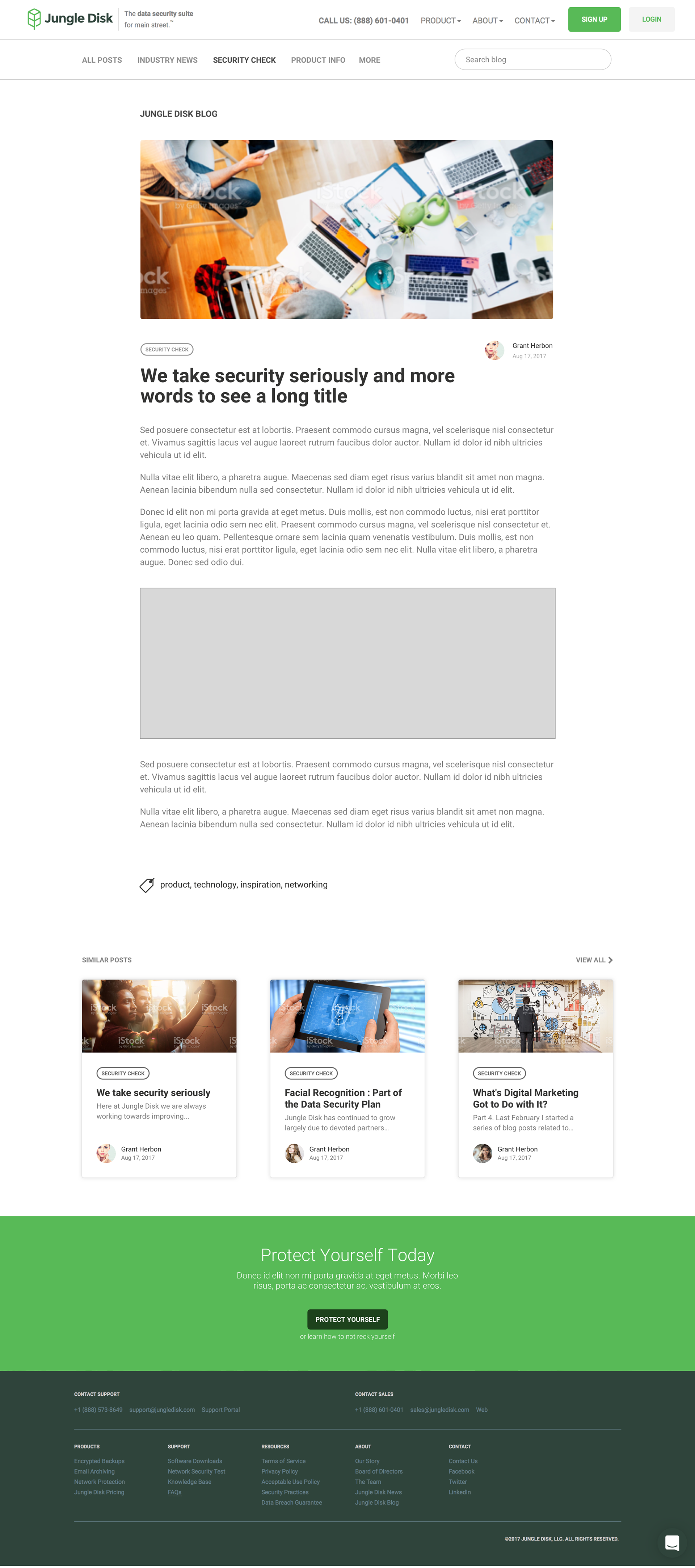
Single Post
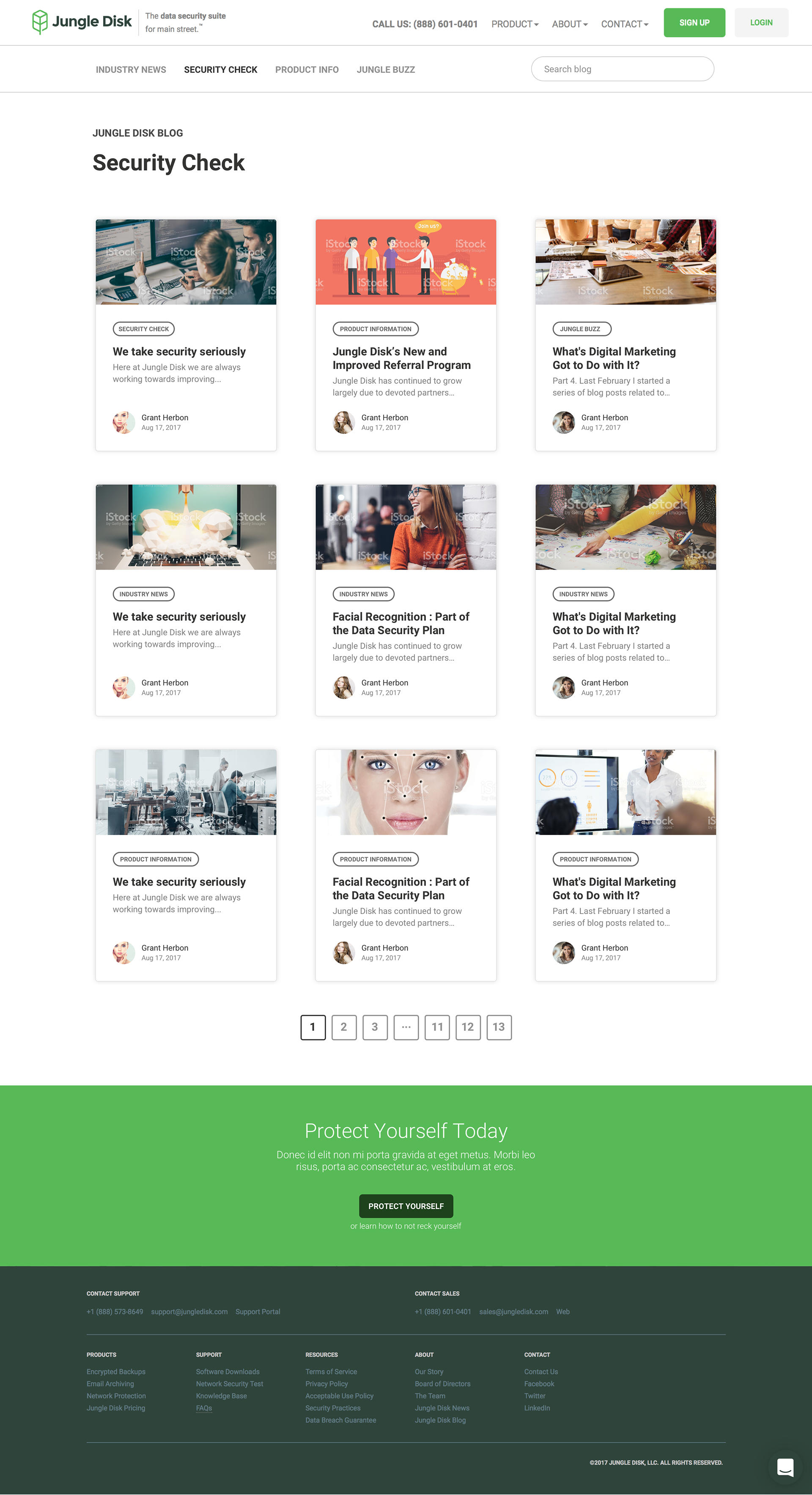
Archives
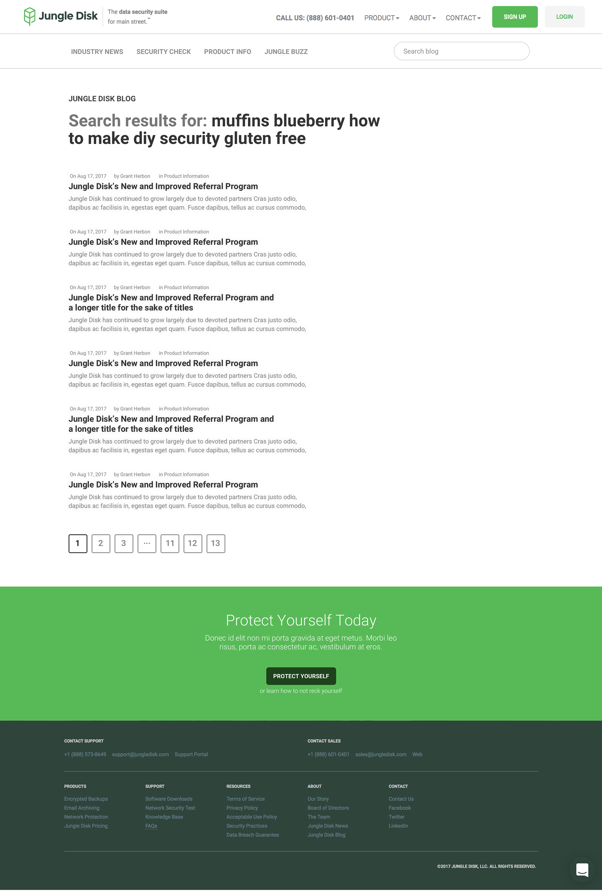
Search
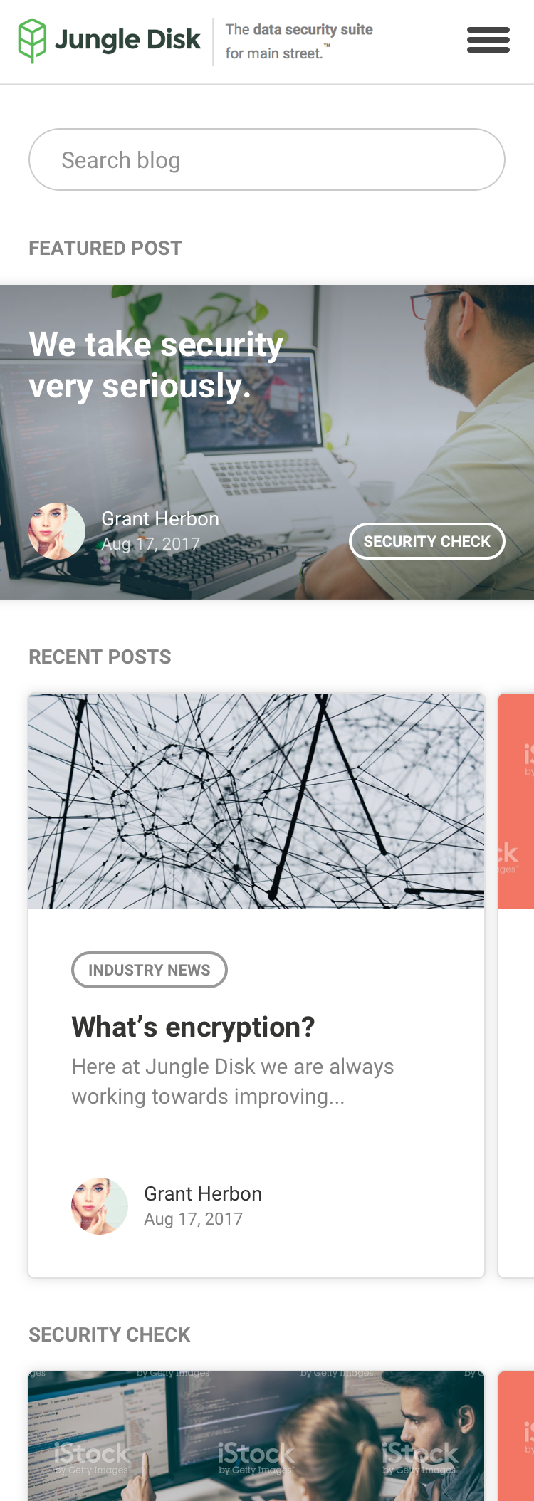
Mobile
Development
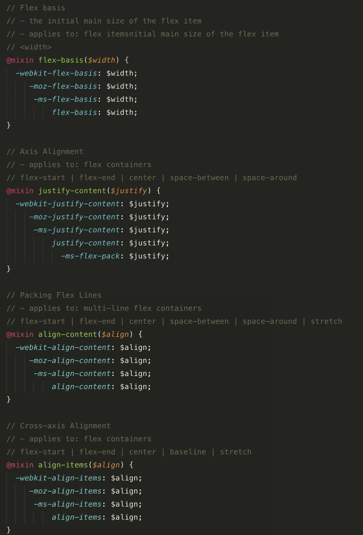
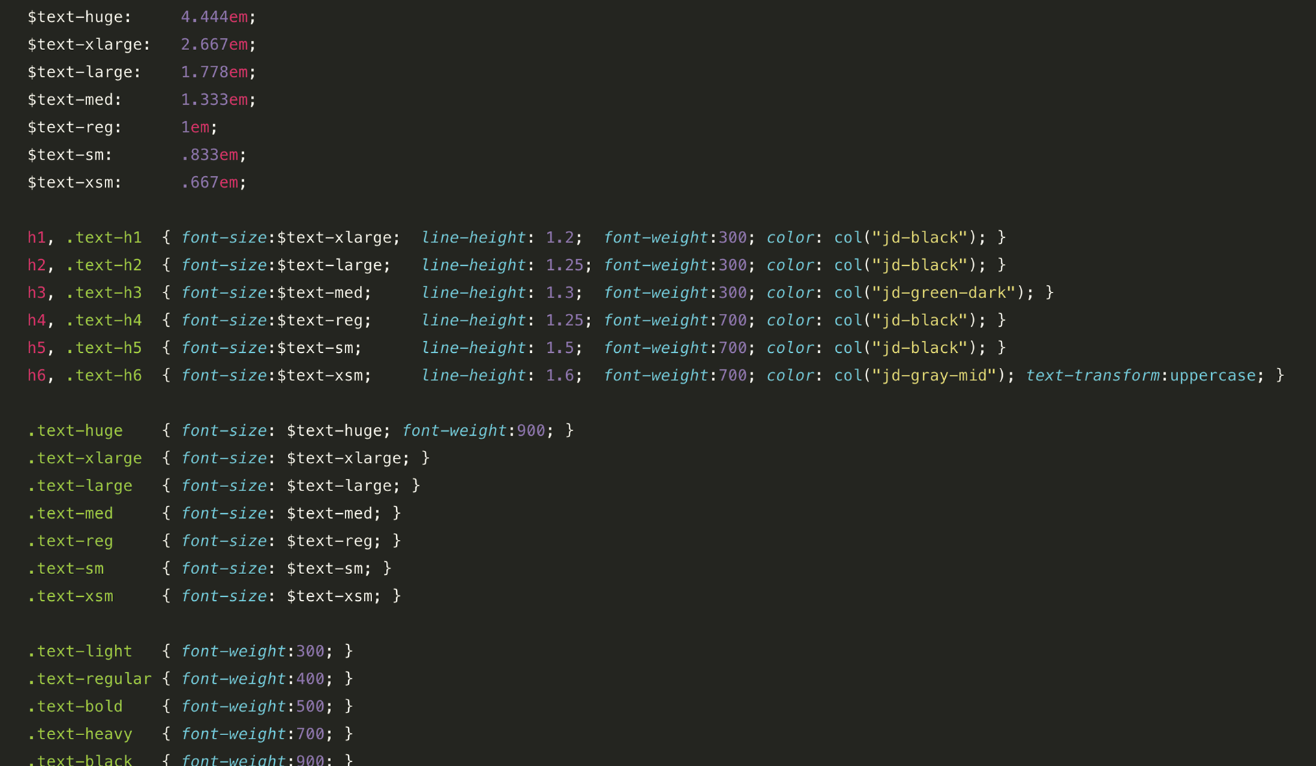
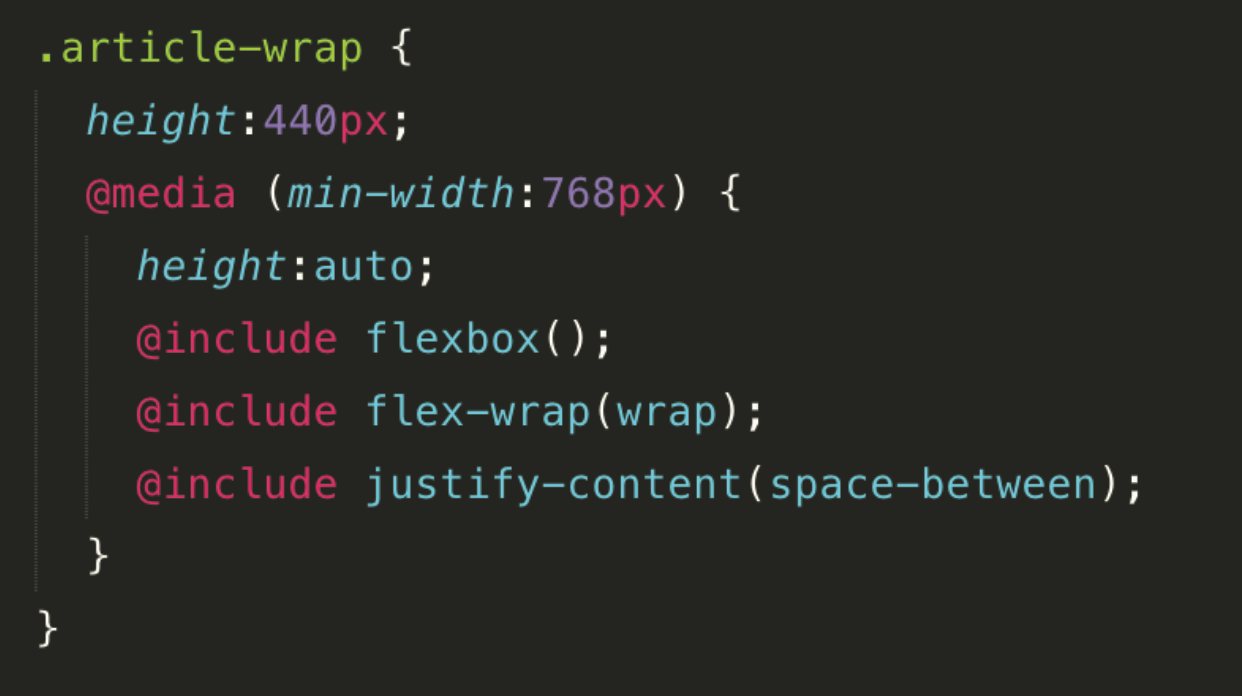
Special consideration was made to extend the existing Jungle Disk design system and ensure a code base that was editable, scalable, and responsive — using flex-box, SASS, and organized typography.
Result
Not only did metrics improve, the blog became a major asset in communicating with customers leading to deeper engagement and improved customer education and retention.